
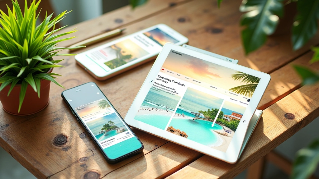
Building Colour Harmony with Tropical Tones
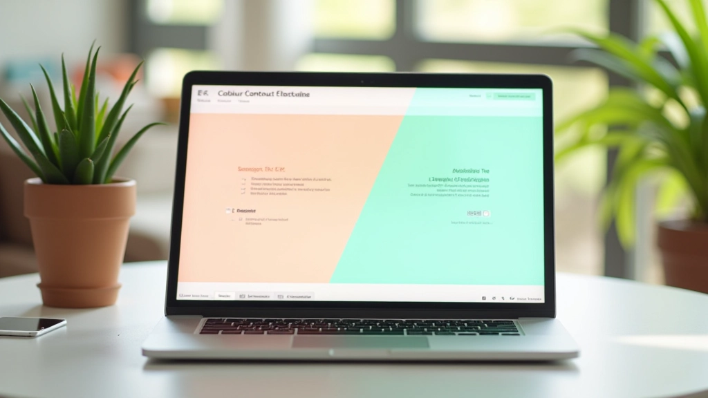
Master the fundamentals of pairing warm corals with cool teals. We’ll explore complementary colour relationships and how to create visual balance.
Bold tropical colours don’t have to sacrifice accessibility. We’ll show you how to maintain readability and meet WCAG AA standards while keeping that vibrant island aesthetic.

You’re designing for the Philippines. The natural landscape screams colour — brilliant coral sunsets, deep ocean teals, vibrant lime greens. Your website should feel like that. But here’s the thing: colour contrast isn’t negotiable. It’s not a nice-to-have. It’s accessibility.
WCAG AA standards require a 4.5:1 contrast ratio for normal text and 3:1 for large text. Sounds restrictive? It’s not. We’re going to show you how to pair those gorgeous tropical tones with text colours that actually work for everyone — including the 1 in 12 men and 1 in 200 women with colour blindness.
Contrast ratio is calculated by comparing the luminance of two colours. White (#ffffff) against pure black (#000000) gives you 21:1 — the maximum possible. That’s great, but it’s also boring for tropical design.
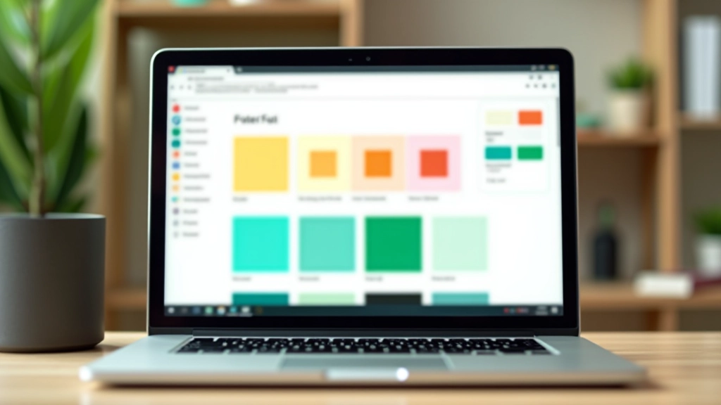
Here’s where it gets interesting. A coral accent colour like #e11d48 (rose-600) has a luminance value that works beautifully with white text at 8.5:1. You’re getting that bold tropical feel while crushing accessibility requirements. The teal ocean colour #0d9488 (teal-600) pairs with white at 7.2:1. Both exceed WCAG AA.
The mistake most designers make? They pick the colour first, then force the text colour to match. Work backwards. Start with your text colour requirements, then select tropical accents that naturally provide enough contrast.
Pro tip: Test every colour combination at 14px (normal text) and 18px (large text). The ratios differ slightly, and WCAG AA has different thresholds for each.
The contrast ratios and colour combinations discussed here are based on WCAG 2.1 AA standards. Actual implementation requires testing with real users and across different devices. Colour rendering varies by screen type, ambient lighting, and individual perception. Always test your final designs with accessibility tools like WebAIM, Stark, or Color Contrast Checker. These are guidelines, not guarantees.
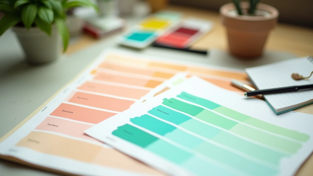
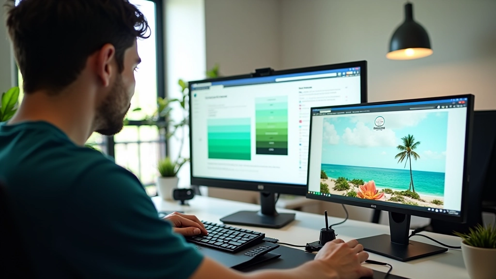
Creating a sustainable colour system means defining base colours and ensuring every pairing works. Don’t just pick random tropical shades. Build layers.
Start with your neutral base. Pure white (#ffffff) is your safest bet for backgrounds when using tropical text. It gives you maximum contrast flexibility. Then layer in your tropical accent colours. We recommend 3-4 primary accents maximum. Coral (#e11d48), teal (#0d9488), and lime (#84cc16) create a cohesive tropical feel without overwhelming users.
For each accent, define the text colour it pairs with. If your coral background needs text, use white or very dark grey (#1f2937). If your teal needs text, white works at 7.2:1. Create a documented colour matrix — literally a table showing every colour combination and its contrast ratio. It sounds tedious. It’s actually a lifesaver when you’re debugging contrast issues at 2am.

You can’t just guess. Use tools. WebAIM’s contrast checker is free and straightforward — paste your hex values and it tells you the ratio instantly. Stark is a browser plugin that shows contrast violations right on your page as you design. Some teams use Accessible Colors, which generates colour palettes automatically while maintaining WCAG compliance.
But here’s what separates good testing from great testing: you’ve got to test with actual users. Especially with colour vision deficiency. Use a tool like Color Blindness Simulator to preview your site as someone with deuteranopia or protanopia would see it. That coral-on-pink combination you love? It might look like a uniform grey to someone with red-green colour blindness.
Don’t rely solely on automated testing. Run your tropical palette through multiple tools, test on different monitors, and involve people with various types of colour vision in your testing. It takes time. It’s worth it.
You want vibrant. You need accessible. These aren’t competing goals — they’re complementary when you approach them strategically.
Start with white or very light backgrounds. They provide maximum contrast flexibility for tropical text colours.
Select 3-4 primary tropical colours. Test each against white and dark grey text. Document the contrast ratios.
Use WebAIM, Stark, and colour blindness simulators. Test on actual devices. Involve users with colour vision deficiency.
Create a colour matrix showing every combination and its contrast ratio. This becomes your design system reference.
Tropical colours don’t have to be a compromise on accessibility. They’re an opportunity to create something beautiful that works for everyone. The Philippines deserves websites that reflect its vibrant natural beauty while remaining accessible to all. That’s not a nice idea — it’s the standard we should be aiming for.
Start testing your colour combinations today. Use the tools we’ve mentioned, document your ratios, and build a colour system that works for everyone.
Get in Touch