
Understanding Gradient Fundamentals
Gradients are more than just eye candy — they’re a powerful design tool when used intentionally. We’re talking about smooth colour transitions that guide the viewer’s eye and create depth without adding extra elements to your DOM.
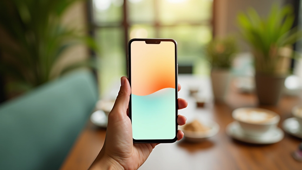
Linear gradients work best for directional colour shifts, like a sunset bleeding from coral at the top to deep teal at the bottom. Radial gradients create that glowing effect you see in tropical sunsets, with colours radiating outward from a central point. The key? Start simple. A two-colour gradient beats a five-colour mess every time.
Think about where your eyes naturally travel. If you’re designing a hero section, you might want the gradient to flow top-to-bottom, drawing attention downward. On a card, a subtle radial gradient can add dimension without distraction.

Browser Support & Performance Note
Modern CSS gradients work across all current browsers, but older versions of Internet Explorer won’t render them. That’s fine — they’ll just see a solid fallback colour. Always include a solid background-color before your gradient property. Performance-wise, CSS gradients are lightweight and won’t slow your site down. They’re rendered natively by the browser, not as images.

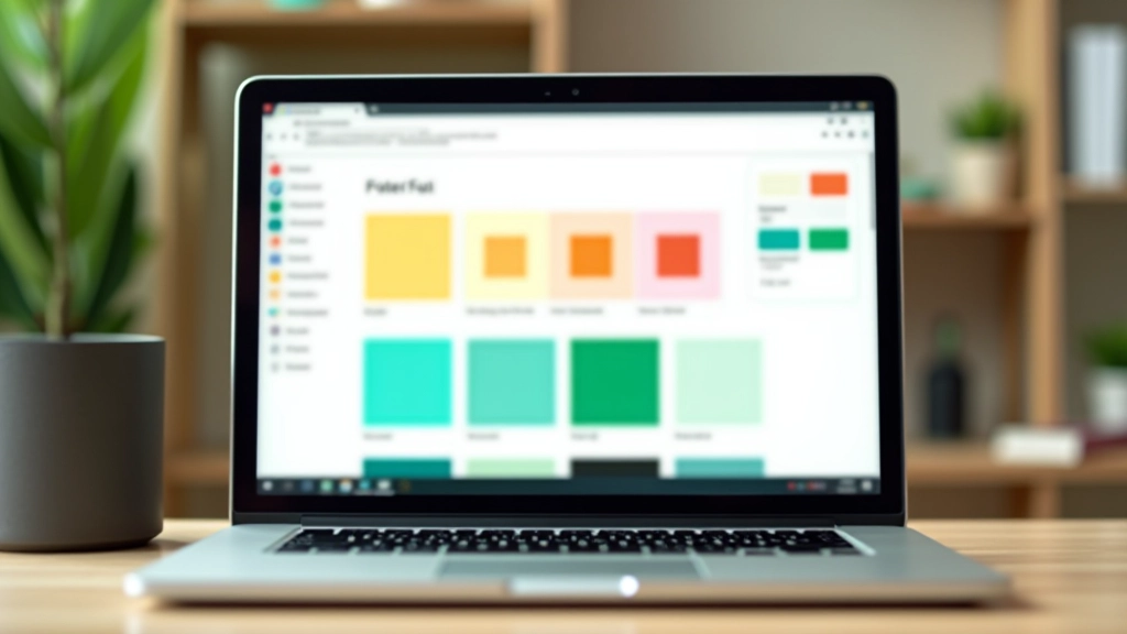
Choosing Tropical Colour Combinations
Philippine sunsets don’t just use one colour — they layer them. You’ll see coral bleeding into orange, then gold, then amber. That’s your inspiration. Pick colours that naturally exist in tropical skies, and they’ll feel cohesive instead of random.
Start with two anchor colours. One warm (coral, orange, gold), one cool (teal, navy, purple). These should sit on opposite sides of the colour wheel. Then, add a transition colour in between — something that bridges them naturally. A gradient from coral (#e11d48) to ocean teal (#0891b2) needs that peachy-orange middle ground to feel smooth.
Don’t forget contrast. If you’re putting white text over a gradient, test it at every point along the transition. That beautiful peach in the middle might be too light for dark text. This is where WCAG compliance matters — you’re not just making it look good, you’re making sure people can actually read it.
Continue Exploring Tropical Design


Practical Implementation Techniques
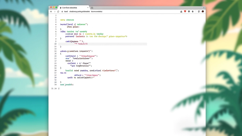
Let’s get technical. A basic linear gradient in CSS looks like this: `background: linear-gradient(135deg, #e11d48, #0891b2);`. That 135deg angle creates a diagonal flow, mimicking how light moves across a tropical sky. Adjust the angle and you change the entire feel.
You can control where colours transition using colour stops. Instead of a smooth blend, you might want: `linear-gradient(to bottom, #f97316 0%, #f97316 30%, #06b6d4 100%);` This creates a sharp division at 30%, with orange dominating the top third and teal taking over below. It’s more dramatic, more intentional.
For backgrounds that need to cover an entire viewport, use `background-attachment: fixed;`. This keeps the gradient locked while content scrolls over it. Warning: it can be slow on mobile, so test it. Performance matters more than pretty.
- Use `to top`, `to bottom`, `to left`, `to right` for simple directional gradients
- Combine with `radial-gradient()` for circular transitions emanating from a centre point
- Test gradients at different screen sizes — they might look different on mobile
- Always include a fallback solid colour before the gradient declaration
Avoiding Common Gradient Mistakes
Here’s what we see go wrong: too many colours. A gradient with seven colours stops being elegant and starts being chaos. Stick to 2-4 colours maximum. Your eyes will thank you, and so will your users.
Another mistake? Using gradients on text. It looks trendy for about a week, then feels dated. Plus, it kills readability. If you absolutely must use a gradient on text, make sure the contrast ratio hits 4.5:1 at every point. It’s doable but difficult — usually not worth the effort.
And this one’s critical: don’t let gradients distract from your content. A hero section with a gradient background? Great. But if your entire page is one giant gradient, users get gradient fatigue. Use gradients strategically — maybe on the hero, maybe on a call-to-action section. Let them breathe.
Finally, test on real devices. Gradients can look different depending on screen technology. What’s smooth on a desktop monitor might appear banded on older displays. Always check on at least two different devices before shipping.
Bringing It All Together
Gradient transitions inspired by tropical skies aren’t just about aesthetics — they’re about creating visual flow and guiding user attention. When you pick colours that exist naturally in tropical environments, and you implement them thoughtfully, you’re creating something that feels authentic and cohesive.
Start simple. Pick two complementary colours from tropical palettes. Use a linear gradient at a 135-degree angle. Test it across devices. Iterate based on what you see. That’s the formula.
The beautiful thing about CSS gradients? They’re lightweight, they’re fast, and they’re infinitely customizable. You’re not limited by preset tools or heavy image files. You’ve got the full power of colour and mathematics at your fingertips. Use it wisely, and your designs will feel fresh, modern, and distinctly tropical.
Ready to design with tropical colours?
Explore more resources and techniques for vibrant, accessible web design.
Browse All Articles