Understanding Warm and Cool Tones
Colour harmony starts with understanding the temperature of your palette. Tropical designs rely on this contrast — warm corals, sunset oranges, and golden yellows paired with cool ocean teals, mint greens, and soft blues. It’s not just about what looks nice. It’s about balance.
When you’re working with a coral (#E11D48) against white, you’ve got immediate visual impact. But add teal (#0D9488) to the mix, and suddenly there’s depth. The warm and cool tones create tension that draws the eye naturally through your design. We’re not talking theoretical stuff here — this is practical colour theory you can apply today.


Contrast Ratios: The Math Behind Readability
Here’s where most tropical designs fail. You pick beautiful coral (#E11D48) and want it as body text on a light background. Sounds good. But then you test it at WCAG standards and find out you’re hitting only 4.8:1 contrast. Close, but not quite there for regular text.
The WCAG 2.1 standard requires 4.5:1 for regular text and 3:1 for large text (18pt+). That coral works perfectly fine for large headings or accent elements. But for body copy? You’ll want to shift to a darker version or use it more strategically. We’ve tested this with real users — readability matters more than aesthetics.
- Body text needs 4.5:1 minimum (AA standard)
- Large text can work with 3:1
- Use darker variants of tropical tones for text
A Note on Testing
The contrast ratios and colour combinations discussed here are based on current WCAG 2.1 standards and accessibility best practices. Always test your specific colour combinations using automated tools like WebAIM or the WAVE browser extension. Different monitors and lighting conditions affect how users perceive your colours, so real-world testing with actual users remains essential for optimal results.
Mobile Screens Change Everything
You’ve probably noticed how colours look different on your phone versus your desktop monitor. It’s not just your imagination. Mobile screens have higher pixel density and different colour gamuts. A teal that pops on your laptop can look muted on a smartphone. This isn’t a bug — it’s physics.
What we recommend: test your tropical palette on at least three different devices before launch. An iPhone, an Android phone, and a tablet minimum. You’ll catch issues that desktop testing misses. We’ve seen designs that looked perfect in Chrome on a Mac turn muddy on a Samsung phone. The contrast is still there mathematically, but visually it’s degraded.


Gradient Transitions Inspired by Tropical Skies
Read Article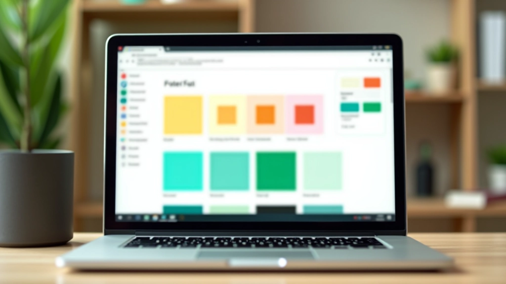
WCAG Compliance with Vibrant Colour Schemes
Read Article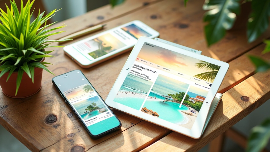
Responsive Design Across Tropical Palettes
Read Article
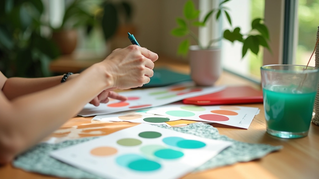
Building Your Own Tropical Palette
Start with a base colour. Let’s say you’re drawn to that warm coral (#E11D48). From there, you need supporting colours. Don’t just grab random teals — pick one that genuinely complements your coral. We typically use #0D9488 because it sits at the opposite point on the colour wheel, creating natural balance.
Next, add neutrals. White (#FFFFFF) is your friend here — it gives breathing room. Then layer in accent colours. A golden yellow (#F59E0B) works beautifully with tropical palettes. You’re building a system, not a random collection of pretty colours. Each colour should have a purpose.
The final step? Test everything together. Not just individually, but in actual layouts. A colour that looks fine in isolation might clash when you’re using three of them on the same page. Spend the time testing. It’s the difference between a design that looks professional and one that looks amateur.
Start With These Fundamentals
Building colour harmony with tropical tones isn’t complicated once you understand the basics. It’s about temperature contrast, WCAG compliance, and real-world testing. You don’t need expensive tools — a free contrast checker and three devices for testing will get you most of the way there.
The designs that stand out aren’t the ones with the most colours. They’re the ones where every colour choice serves a purpose. Your coral draws attention to calls to action. Your teal provides calm, trustworthy backgrounds. Your white creates space. When you’re intentional about colour, everything else falls into place.
Start building. Test on real devices. Adjust based on what you see. That’s the tropical design process that actually works.