We’re Isla Horizon Ltd
Crafting vibrant tropical design experiences for Philippine websites. We blend the natural beauty of island palettes with modern web standards, creating visuals that inspire and engage across every device.
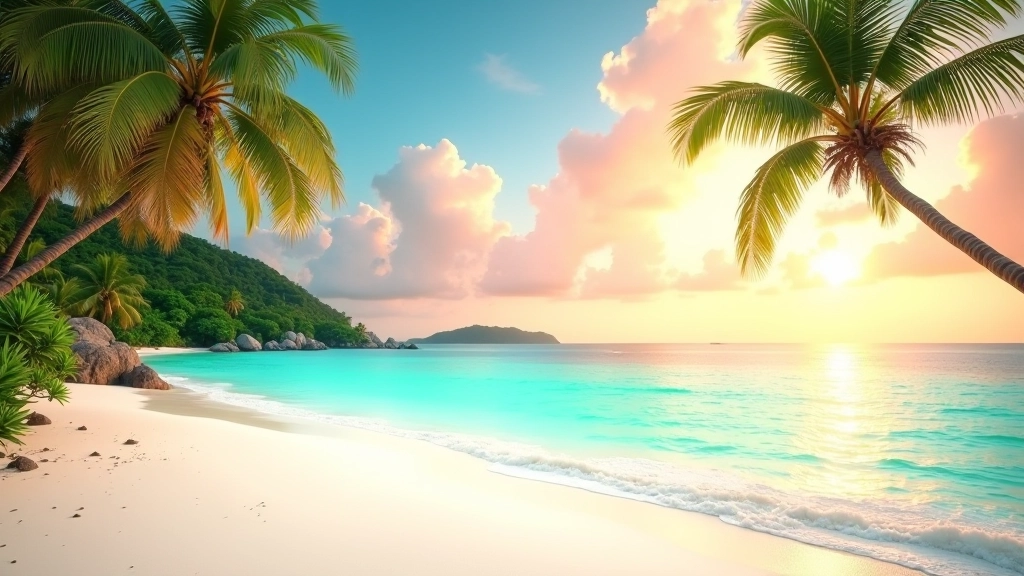
Design That Reflects Island Beauty
We started Isla Horizon Ltd because we saw something missing. Philippine web design wasn’t capturing the authentic warmth of tropical landscapes. We’ve built our entire practice around one core idea: your website should feel like the islands look. Warm sunset coral. Ocean teal. Lush greens. Not as random colors, but as a cohesive system that tells a story.

Tropical Tones That Actually Work
We don’t throw colors at the wall. Our tropical color palette for Philippine websites is built on hierarchy. Warm sunset coral commands attention. Ocean teal creates calm. Lush green brings life. Bold accents pop against clean white backgrounds. That’s the formula we’ve refined over countless projects.
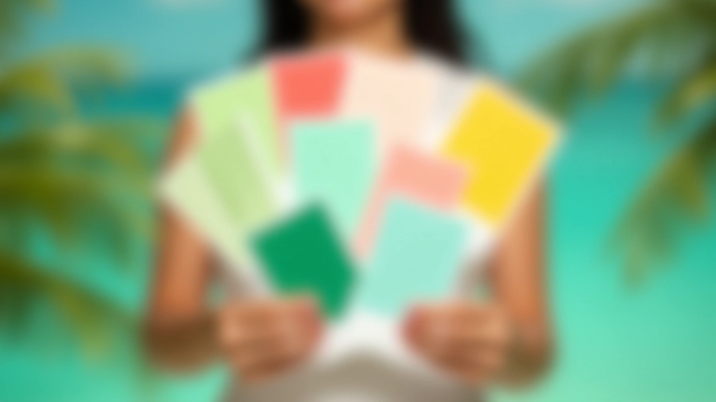
Every Shade Has a Purpose
Sunset Coral
Primary accent for calls-to-action. Warm, inviting, energetic. This is where you want user attention to land.
Ocean Teal
Secondary interactions and calm zones. Creates visual balance and represents the peaceful island waters.
Island Green
Growth and positive actions. Brings natural energy. Perfect for success states and confirmations.
Inspired by Philippine Island Culture
The Philippines isn’t just beaches and sunsets. It’s a specific light. A particular warmth in how colors blend at dusk. The exact shade of teal where the ocean meets the sky. We spent time studying these natural color transitions — not for nostalgia, but because they work. They’re rooted in human perception and emotion. That’s why our vibrant visual design for Philippine websites resonates. It’s not forcing tropical aesthetics. It’s reflecting what’s actually there.
Beauty Doesn’t Mean Sacrifice Readability
We’ve seen plenty of “tropical” websites that look great on desktop but become a contrast nightmare on mobile. That’s not design — that’s irresponsible. Every color combination we use maintains readability across all devices.
WCAG Compliance
Minimum 4.5:1 contrast ratio on all text. Your vibrant palette doesn’t get to sacrifice accessibility. Both matter.
Mobile-First Testing
Every color combination tested on devices from 320px to 1440px wide. Responsiveness isn’t an afterthought — it’s built in.
Gradient Transitions
CSS gradients inspired by tropical skies. Smooth, natural transitions between colors that enhance rather than distract.
Cross-Browser Testing
Colors render consistently. We don’t guess. We test on real devices and browsers to ensure your tropical palette displays perfectly everywhere.
Let’s Create Something Vibrant Together
Isla Horizon Ltd brings tropical color palettes and vibrant visual design to life. We’re not building generic websites. We’re creating experiences that feel authentic to the Philippines — colorful, warm, and built to perform on every screen.
Start Your ProjectImportant Information
The design guidance and color strategies shared on this website are for educational and informational purposes. While we’ve carefully tested tropical color palettes and vibrant visual design approaches, individual project results depend on many factors including implementation, specific use cases, device capabilities, and user preferences. We recommend testing all color combinations and gradient transitions thoroughly on your target devices before full deployment. Each website’s performance with tropical tones may vary based on content, target audience, and specific accessibility requirements. We’re happy to discuss how to apply these principles to your specific project — please reach out through our contact page.