Building Colour Harmony with Tropical Tones
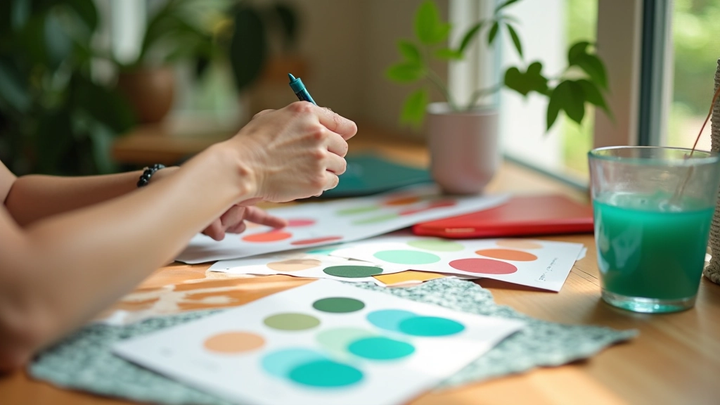
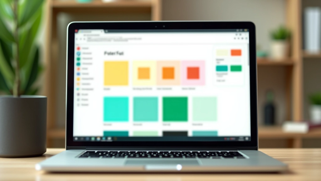
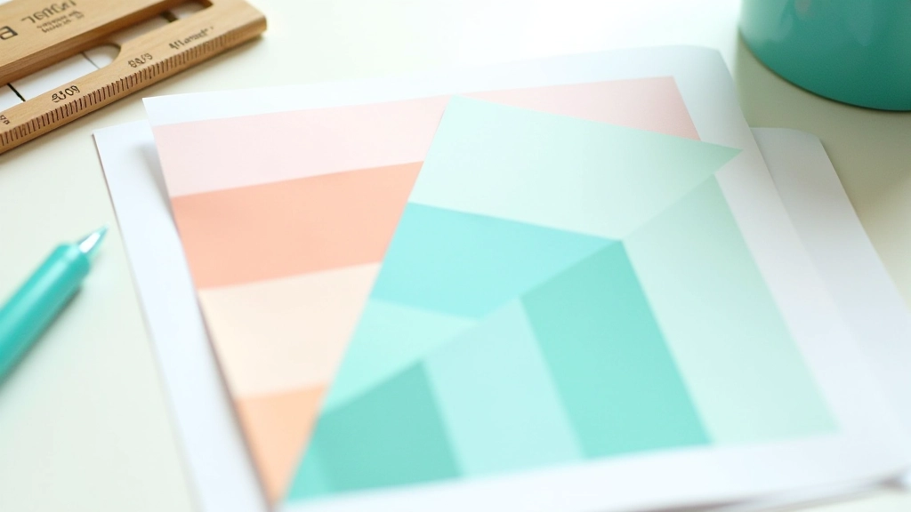
Master the fundamentals of pairing warm corals with cool teals. We’ll explore colour theory and practical combinations that work.
Colours behave differently on mobile screens. Learn how to test and optimize your tropical palette for every device and browser.
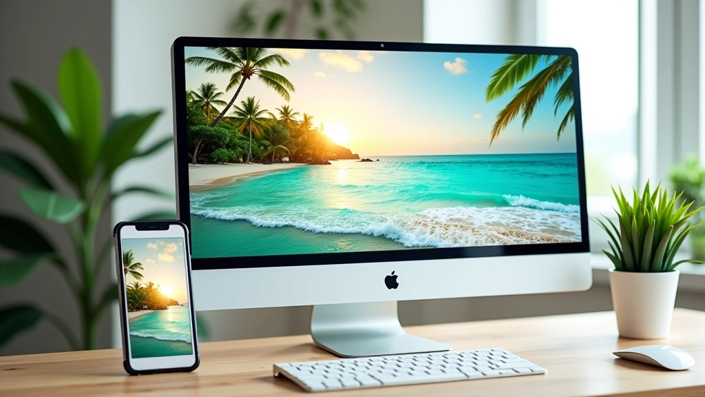
You’ve picked the perfect tropical palette for your website. Warm sunset corals, ocean teals, lush greens — everything looks stunning on your 27-inch monitor. Then you pull it up on your phone and something feels off. The colours don’t pop the same way. Text might be harder to read. The vibrant harmony you created seems to shift.
Here’s the thing: colours don’t just exist in isolation. They’re affected by screen brightness, pixel density, refresh rates, and how your browser renders them. What looks crisp on a desktop can appear washed out on a phone in sunlight. The opposite happens too — a colour that’s perfect on mobile can feel too intense on a larger screen with different lighting.

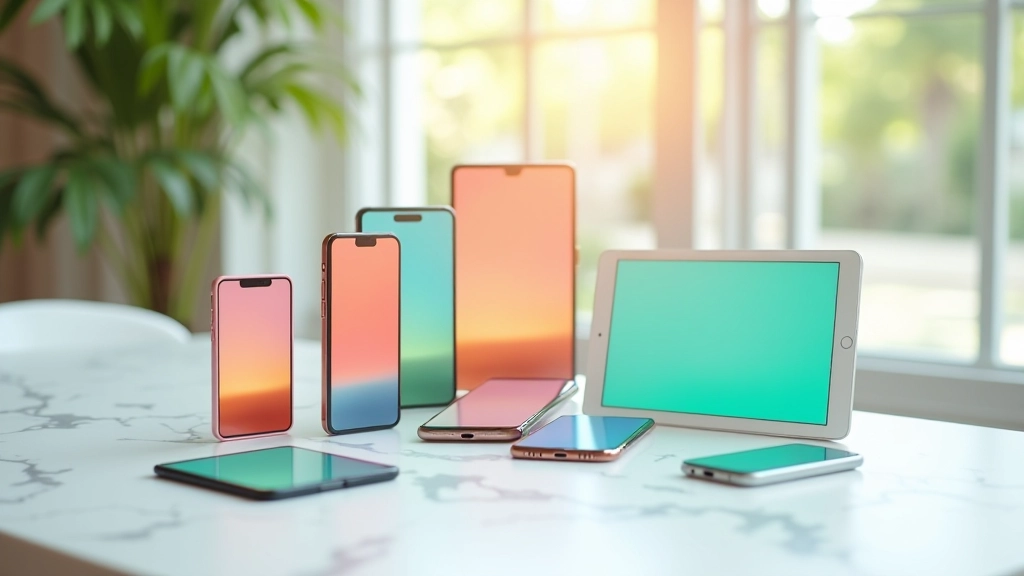
Your phone’s screen is smaller, brighter, and often viewed at different angles than a desktop. OLED screens render colours more saturated than LCD panels. A coral that’s perfect at 100% brightness might look blown out when someone’s using their phone outdoors. Meanwhile, the same colour on a desktop with lower brightness might feel muted.
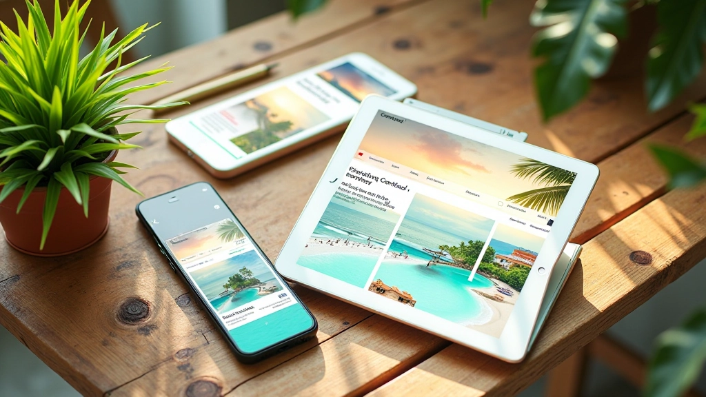
The absolute best way to check your tropical palette is on actual phones and tablets. Not just your own device — try different brands, screen sizes, and ages. A three-year-old iPhone looks different from the latest model. Android phones vary wildly. Don’t rely solely on Chrome DevTools simulation.
We recommend testing on at least four devices: a recent iPhone, a recent Android phone, a tablet, and desktop. Check them in different lighting conditions. Your design team’s dark office isn’t representative of someone using your site on a sunny beach. That’s kind of the point with tropical design — it needs to work in actual tropical environments with bright natural light.
Take screenshots at different brightness levels. You’ll be surprised how much your colour choices shift. What looks like perfect coral at 50% brightness might be orange at 100%, or salmon at 20%.
Colour rendering varies across devices, browsers, and operating systems. This guide is educational and based on common web design practices. Always test on real devices before launching. Browser compatibility tools and colour analysis software can support your process, but they’re not substitutes for hands-on testing with actual users in real environments.
Contrast gets trickier on mobile. Your 36-pixel headline might look great at desktop size, but shrink it to 18 pixels on a phone and suddenly that coral text on a light background isn’t as readable. Tropical palettes use warm, bright colours that can feel less contrasty than neutral tones.
The WCAG AA standard requires a 4.5:1 contrast ratio for body text. Your tropical palette needs to hit this. A light coral on white might fail the test. You’ll need to either darken the coral, lighten the white background, or switch to a different colour combination. There’s no magic trick here — you test, measure, adjust.
Use tools like WebAIM’s contrast checker. Plug in your actual hex values and see if you’re hitting the standard. On mobile especially, don’t assume it works. The smaller text size makes contrast even more critical for readability.

Here’s something that catches people off guard: different browsers render colours slightly differently. Safari on iOS handles colour spaces differently than Chrome on Android. Firefox might display a teal slightly more blue than Chrome. These differences are small — maybe 2-5% variation — but they’re real.
You can’t control how browsers render colour. What you can do is test in multiple browsers. Check your tropical palette in Safari, Chrome, Firefox, and Edge. On both desktop and mobile versions. It’s tedious, but it matters when you’ve built your entire design around specific colours.
One strategy that helps: avoid colours that sit right on the edge of perception. If you’re using a coral that’s 98% of the way to orange, small rendering differences will push it fully into orange territory on some browsers. Pick colours with a bit more room to shift without losing their identity.
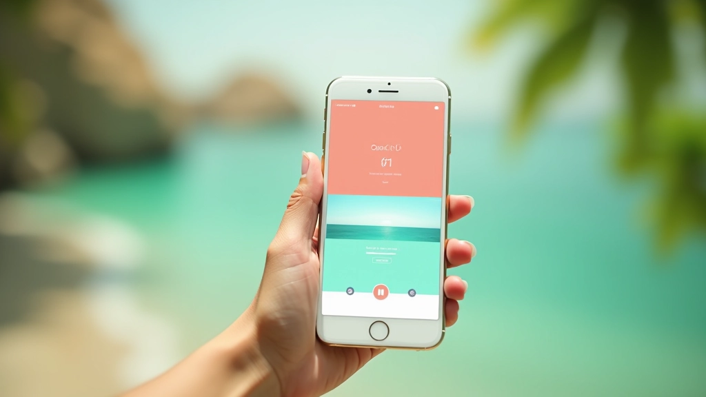
Start with mobile. Design your tropical palette first on a phone-sized screen, not desktop. That’s where most of your traffic comes from anyway. If your colours work at 375 pixels wide with phone brightness, they’ll work almost everywhere else.
When you’re picking tropical colours, test them at multiple sizes. Your accent coral might be perfect for a 60-pixel button on desktop, but what about a 32-pixel button on mobile? Does it still read as a distinct colour, or does it blend with the background? Small sizes reduce how much colour information the eye receives.
Create a colour testing document. A simple HTML file with your coral, teal, and green colours in different sizes and combinations. View it on all your test devices. Update it as you refine your palette. This becomes your reference for the entire project. You’re not guessing anymore — you’ve got documented proof of what works.
Responsive tropical design isn’t just about making your layout fit different screen sizes. It’s about making sure your carefully chosen colours actually perform as intended across devices, browsers, and lighting conditions. You’ll spend hours perfecting your coral and teal combination. Don’t skip the testing phase.
Test on real devices. Check contrast ratios. View your site in different browsers. Look at it in bright light and low light. Adjust based on what you see, not what you think should happen. Your tropical palette has the potential to be stunning on every device — but only if you verify it works first.
Ready to build your tropical colour system?
Explore More Guides